Why We Should Care About Slide Design
Love it or hate it, many of us regularly have to give presentations.
That means making slides.
Only, most of us never get any formal education in slide design. Not that one has to have a formal education to design good slides. It just means there’s a lot of variability in how it’s done. And unfortunately, there are some common design choices that make it hard for the audience to understand or enjoy the presentation, and, in turn, make it hard for a presenter to succeed.
Making good slide design choices benefits both the presenter and the audience because they make the message clearer and the presentation more engaging. But, how do we know what makes something a good design choice?
The answer is: neuroscience.
By analyzing how the human brain processes information, we can make design choices that work with our neurology instead of fighting against it, leading to more effective and impactful presentations.
The Neuroscience of Information Processing
Studies of the human brain show that when it engages in the act of listening, it activates the auditory cortex of the brain.1 No surprise there; straightforward brain-part naming! Good job, neuroscientists. And when the human brain processes visual information, it activates the visual cortex.1 So far, so good.

Now, here’s where things get tricky. It has been shown that when the brain engages in the act of reading, it activates the visual cortex and the auditory cortex even though there is no sound.2 This is because reading is a new skill for the human brain. We didn’t evolve to read. So to process the written information, the brain recruits the part of it that originally evolved for spoken language: the auditory cortex. In fact, it’s not uncommon for people to “hear” a voice narrating the words as they read.2 And once the auditory cortex is engaged in processing language through the act of reading, that makes it hard for it to shift over to processing language through listening. Reading and listening compete for the same neural resources.3
This leads to something called “inattentional deafness,”4 meaning that when we are absorbed in reading, it makes it harder for us to hear. Further, studies of inattentional deafness show that the more complex a task is, the more “deaf” a person becomes. In other words, if we see someone heavily engrossed in a book, we might as well imagine they are wearing headphones that cut off their ability to hear their surroundings.

So the big takeaway from neuroscience is:
People are not good at reading and listening at the same time. They can read or they can listen, but they cannot do both well simultaneously. Science says keep slides simple.
Issues With Common Design Choices
Now, take a moment to think about what the typical slide looks like. Something like this, perhaps?

It’s very complex. It’s got a lot of text, probably a detailed graph as well. It’s hard to know where to look first, so maybe we try to figure out the graph for a bit, then we start reading the text, and— suddenly we realize the speaker has been talking for the last several minutes, and we haven’t heard one. darn. thing. that they said. We just experienced inattentional deafness when presented with a complex visual task!
So I ask: What is the point of giving an oral presentation?
To be heard, one would think.
And yet, if we create busy slides that become complex visual tasks, we are effectively telling the audience not to listen. Or, perhaps worse, we are telling the audience to listen but simultaneously making it hard for them to do so. If we want our audience to read, that’s a paper. If we want our audience to listen, we need to craft slides that account for inattentional deafness and work with how the brain processes information.
Why Poor Slide Design Is a Thing
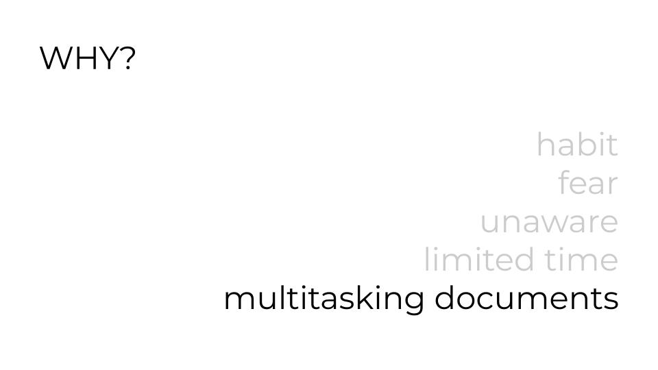
If the science is clear that slides should be kept simple, why do we so frequently see slides that look like the one above? It’s not because people don’t care—it’s far more complex than that. There are a number of very relatable, very human reasons:
- The habit is hard to break: We already learned how to make slides a certain way, and that’s the way we do it. We may even be emotionally attached to our personal style.
- Fear: Making slides that look different from everyone else’s slides is scary. Humans evolved to fear ostracization because it could literally threaten our survival if we got kicked out of our tribe.
- Unawareness: Most presenters aren’t aware of these quirks of human neurology and haven’t had the chance to consider them when making design choices.
- Limited Time: Ironically, designing simple, audience-optimized slides is time-consuming. It’s easier to just slap a bunch of stuff on one slide. Mark Twain (at least, probably Mark Twain) said, “I didn’t have time to write a short letter, so I wrote a long one instead.” This concept applies to slide design as equally as writing.
- Multitasking of Slides, i.e., the deck is also the meeting notes: This is one of the hardest and most pervasive obstacles to overcome. A slide deck optimized for oral presentation is necessarily different from meeting notes or read-after materials. Yet, it is very common to treat meeting slides as meeting documentation, even though the two functionalities are completely at odds with each other.
Better Design Choices
Knowing about inattentional deafness and common obstacles to better slide design choices, what are the ways we can improve our slides?
- Keep text to a bare minimum. The less there is for the audience to read, the more time they can spend listening with their full attention. To give you an idea of what I think “bare minimum” is, I analyzed the word count of one of my slide decks. My average word count per slide was 12.75 with a standard deviation of 7.90. Most of my slides had anywhere from 5 to 21 words. Here’s an example:
- Minimize concepts per slide. When making digital slides, more slides are essentially free. We can spread content over as many slides as we need, and when we can, put only one idea per slide. This means making strong choices about logical order, and that’s a good thing.
- Control the flow of information. Think of the presenter as a museum docent leading a guided tour. A complex slide with no clear focal point is like letting the tour group roam freely in a crowded exhibit—everyone is looking at something different while the docent speaks. We don’t want to let this happen; we want to keep them with us. That means guiding our audience’s attention by revealing content gradually, making it easy for them to follow what we’re talking about at each moment. Do this by animating* items to appear as needed and/or grey out or highlight things to make it very clear what we are focused on at any given moment.
* – I don’t personally use animations because they frequently break, and I am a control freak. Instead, I made a new slide for each new item that would otherwise appear via animation.
- Use relevant images. The brain can process pictures faster than words, so they create less of a distraction and can quickly convey or support our message. Keep in mind that complicated images like graphs that have to be read are, well, equivalent to reading and can create the same distraction as a block of text.
- Push back against multitasking slides as reading documents. Spoiler: we won’t be able to avoid this completely. It is far too prevalent a practice, even though I think it’s a counterproductive one. But when there is time for it, make a text-heavy version for reading and a separate version for presenting. Or try using AI to either make a text-document version of the deck or use an AI note-taker during the meeting to generate notes (but be careful with proprietary information!).
Signal to Noise Ratio (SNR) for Slides
Another way of thinking that can help us make good design choices is the concept of “Signal to Noise Ratio” or SNR. SNR is a way to quantify the quality of data. A simple example would be radio static. If you are listening to a radio station with a lot of static, it’s hard to enjoy the music because the amount of music (the signal) is low compared to the amount of static. On the other hand, if the static is low, the music is crisp and easy to listen to: that is a high SNR.
We want our slides to have a high SNR (maximum signal, minimum noise) to help convey our message. Analyzing our design choices based on how they impact SNR can help us make simpler, more effective slides.
The idea of applying SNR to written and verbal communication was first introduced to me by physicist-turned-communication-expert Dr. Jean-luc Doumont. And, as Jean-luc says, anything that doesn’t support the message is a distraction from it. There are no neutral design choices; if it’s not part of the message, it’s noise.
Let’s consider some common noise sources:
- Too much text. Already discussed earlier, but worth emphasizing. Too much text functions as noise because it reduces the audience’s ability to hear by creating inattentional deafness.
- Too many ideas on one slide. This is the flipside of “one idea per slide.” When there are too many things at once, the audience moves off in different directions (think about the wandering museum tour group), and they aren’t necessarily looking at the part of the slide that the presenter is talking about. Too much text and too many ideas often go hand-in-hand.
- Illegibly small fonts. If a font is too small for people to read, it’s pure noise. Fonts that are too small are also often a result of trying to squeeze too many things on a slide. If we ever hear a presenter say, “this slide is a bit of an eye chart,” that is a clear indication the font is too small. Our known troublemakers, “Too much text” and “Too many ideas,” also really like to hang out with the gangster known as “Tiny Font.”
- Missing information. Interestingly, the absence of key information can also constitute noise. For example, a missing legend or axis labels on a graph creates noise because it creates a complex (and confusing) visual task for the audience. Be careful to avoid creating unintended puzzles.
- Excess and non-strategic color usage. There are several considerations here.
- Some people are color blind. Did we use a red line and a green line on the same graph? They would be indistinguishable to someone who is red/green colorblind. Using dashes or dots can help to resolve this issue.
- Some colors create poor contrast (such as yellow text on a white background) and make them harder to look at. This applies to fonts, graphics, and lines on graphs.
- Using too many colors and not using colors consistently creates a confusing visual task for the audience. People may go looking for patterns that aren’t there; again, be careful to avoid creating unintended puzzles.
- Unnecessary “extras” like busy backgrounds. A cool background might be cool, but does it support the message? If it doesn’t, it’s noise. Question everything, including logos, footer content, and graphical features. I also have a controversial opinion that bullets are “extra” (on slides! not in written documents) and indicate that too much text is in play. Because what are bullets for? They help to indicate that even though text is on two or more lines, it’s still just one “item.”
- Inconsistency in layout and font. Using a lot of different font styles and sizes creates visual complexity without a strategic purpose. Allowing the positions of slide numbers or titles to wander around creates the appearance of movement, and because rapid detection of even subtle movement is a hardwired human survival trait, it’s really distracting.
An Important Note on First Drafts
Don’t worry too much about most of these design principles when making a first draft. Messy first drafts are totally fine. It’s the editing process where we will apply most of these design principles. As the prolific novelist Stephen King wrote, “to write is human, to edit is divine.” As we refine our draft, we can progress from the more central issues of minimizing text and number of ideas on a single slide to the more nitty-gritty issues of color, fonts, and consistency. Only, that takes time. So starting early to give ourselves enough time to revise (and practice) is a critical part of the process.
Conclusion
Slide design is complex, but an understanding of how the human brain processes information can help. It’s also valuable to recognize the various barriers that can stand between us and good design choices—both the internal and external ones. Overcoming our own habits can be just as hard as confronting the expectations of our team that slides should look a certain way or be multitasked.
However, taking the time and making the effort to design better slides is worth it. It increases the effectiveness and the impact of our communication. That, in turn, supports our goals and career success. It also makes the process of listening and learning more enjoyable for the audience. It is a win-win.
So the next time you build a slide deck, remember:
- Science says keep slides simple.
- Acknowledge the barriers that might be in play, whether it’s habits, fears, or pressure to conform or multitask slides.
- Let the first draft be messy and refine it through careful (divine) editing.
- Start early so there is time to revise and make good design choices.
- Use the concept of SNR to make slides more impactful.
I hope the above helps you to make better slides for the benefit of both you and your audience!
First published in the Virtuous Cycles Newsletter on 5.16.2025
By Christina C. C. Willis
Further reading
- Questions About Presentations: A Rarely Asked Question: “How many words should I put on each slide?” by Darcy Gentleman
- Effective oral presentations by Jean-luc Doumont
- Trees, maps, and theorems by Jean-luc Doumont
- PowerPoint or Powerless Point? When reading takes over… by Shilpi Jain
- Rethink Digital Slide Presentations by Mike van der Vijver
Addendum: Why Christina Cares So Much About Slide Design
Like many, I received no formal education in slide design during my schooling. The first dedicated education I got on slide design and communication was a workshop that I attended in graduate school given by Jean-luc, the communication expert I mentioned earlier, who taught me how to apply SNR to design. Over the years, I also received feedback from my advisor as an undergraduate and from my research group as a graduate student. Overall, I would say my slide design skills were pretty good.
Then, I began my career as a paid public speaker. Actually, let’s back up a step. Before I was a paid public speaker, but as I was starting to give more talks, an old classmate of mine asked me if I could give a talk at the high-profile tech company where she worked. This idea both excited and terrified me. It was exactly the sort of high-profile (high-paying) speaking opportunity I wanted. But I did not feel ready. A big part of that “not ready” was my slides. I thought they were okay, but I knew that okay wasn’t enough. Once I started to ask for compensation for my talks, “pretty good” simply was not going to cut it. My slides needed to look professional.
I asked around and got an introduction to Dr. Darcy Gentleman, a chemist-turned-communication-expert who specializes in presentation coaching, among other things. He took me through a painstaking process of refining both my slide design and delivery, which ultimately got both me and my slides to a place where I felt ready. I have since given numerous paid and well-received presentations (though, not at that high-profile tech company… yet). And I frequently get compliments on my slide design (thanks, Darcy!).
Then, something kind of terrifying happened.
A client asked if I could give a presentation on how to design and deliver presentations.
I got an instant and vivid flashback to a horribly boring talk I had attended as an undergraduate that was supposed to teach me how to prepare and give a good presentation. Needless to say, the person immediately lost all credibility with me by not being an engaging speaker. I flinched at the idea of taking a risk, failing, and becoming that speaker.
Because in my mind, the stakes for designing and giving the very meta presentation on how to design and give presentations are higher than any other talk. Everything is under scrutiny. Every word said. Every design choice. It’s all on the table for judgement, and you have to both be good at it and practice what you preach while you are preaching it. Having been giving workshops for a few years, I felt like I was ready to take a run at it and see what happened.
It had been a few years since I had designed a new deck or workshop. It was deeply weird to watch myself build the thing I was describing building as I built it, kind of like the statue of the self-made man chiseling himself out of a block of stone. In addition to my existing knowledge base, I did research to more fully understand my material and ensure that my approach was scientifically sound. In the end, I developed a deeper understanding of the forces at play and created a presentation that I was proud to deliver. And based on feedback, I did not become the unfortunate speaker I remember from undergrad.
That workshop and my renewed foray into design are the basis of this newsletter. I hope you have found it and this story enjoyable.
I want to acknowledge and offer thanks to Dr. Jean-luc Doumont and Dr. Darcy Gentleman. Their insights and guidance on communication, slide design, and presentation delivery have been instrumental in shaping my own style and views on this subject.
References
- Javed, K., Reddy, V., & Lui, F. (2023). Neuroanatomy, Cerebral Cortex. National Library of Medicine. https://www.ncbi.nlm.nih.gov/books/NBK537247/.
- Petkov, C. I., & Belin, P. (2013). Silent Reading: Does the Brain ‘Hear’ Both Speech and Voices? ScienceDirect, 23(4). https://doi.org/10.1016/j.cub.2013.01.002.
- Deniz, F., Nunez-Elizalde, A. O., Huth, A. G., & Gallant, J. L. (2019). The Representation of Semantic Information Across Human Cerebral Cortex During Listening Versus Reading Is Invariant to Stimulus Modality. Journal of Neuroscience, 39(39), 7722-7736. https://doi.org/10.1523/JNEUROSCI.0675-19.2019.
- Molloy, K., Griffiths, T. D., Chait, M., & Lavie, N. (2015). Inattentional Deafness: Visual Load Leads to Time-Specific Suppression of Auditory Evoked Responses. Journal of Neuroscience, 35(49), 16046-16054. https://doi.org/10.1523/JNEUROSCI.2931-15.2015.
